Portfolio
IA and Search Improvements
Case Study
Following a full content audit, collaborating closely with Product, Support, and Design teams, the goal was to improve self-service success, reduce support friction, and prepare the site for integration with AI-driven search tools.🔍The Brief
By early 2024, the Employment Hero Help Centre had become a sprawling, organically grown resource hub. Despite its rich content, users struggled to find what they needed. The brief was clear:“Make the Help Centre easier to navigate, align it more closely with the in-app experience, and surface high-priority content more effectively—without losing access to deep documentation.”The goal was to improve self-service success, reduce support friction, and prepare the site for integration with AI-driven search tools.-------As Content Team Lead, I was responsible for leading the project from strategy through implementation, working closely with stakeholders across Product, Support, and Design.-------🎯 Objectives
- Align navigation with user behaviour and platform structure
- Simplify access to commonly requested topics
- Improve visual clarity and reduce cognitive load
- Create a scalable structure that could support AI and contextual surfacing
- Deliver measurable improvements in self-service adoption
Customer Research
To inform the redesign, we conducted customer and internal user research focused on Help Centre discoverability and search performance. We used two channels:Proactive user outreach via Braze messages in the Help Centre, inviting customers to share their experience navigating the siteInternal interviews with employees across Support, Product, and CX teams
-------From this, we discovered consistent themes:- Users often found search queries to be inaccurate or too literal.
- The information architecture (IA) lacked clarity, making it difficult to predict where key resources would be located.
- Both customers and employees struggled to find content quickly—even when they knew what they were looking for.
- These insights directly shaped our IA overhaul and content optimisation strategy.
Deliverables
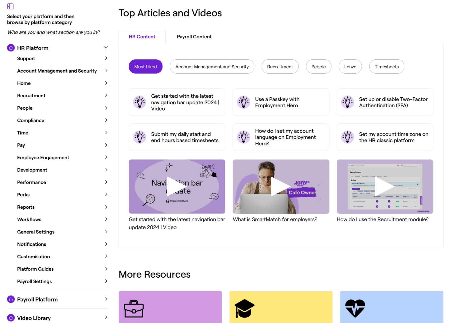
1. Introduced a Left-Hand Navigation Menu
Replaced the outdated top-nav format with a persistent side menu, mirroring the structure of the Employment Hero app.This improved user orientation and allowed for more contextual content groupings.2. Created a Targeted Meganav for Priority Content
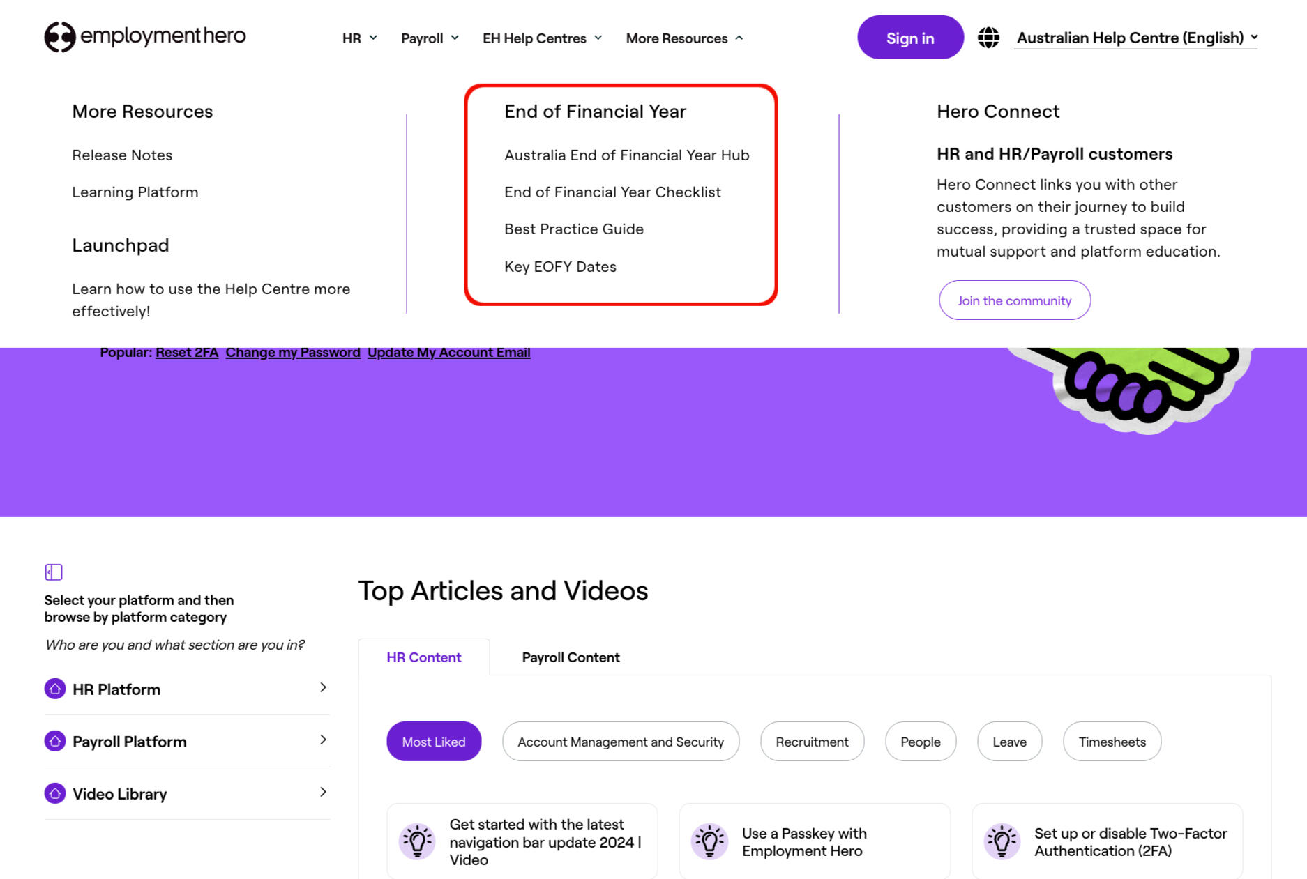
Designed a top navigation space to house high-traffic, time-sensitive content such as EOFY hubs, major feature announcements, and onboarding support.This gave users instant access to what matters most—reducing time-to-resolution.3. Restructured Article Groupings and Hierarchy
Conducted a full IA review to consolidate overlapping categories and remove outdated labels.Used feedback from research and behavioural data from Zendesk and reframe how users locate key topics.4. Integrated UX Writing and Metadata for AI Readiness
Ensured that navigation and article tags were machine-readable and consistent.Aligned content structure with early-stage deployment of generative search and agentic workflows.
Results
- After inital content audit we saw 15% increase in self-service adoption and the site added another 5%- Positive feedback from CX and Support teams on reduced ticket repetition- Improved content discoverability, especially for new users- A navigational model now being used as a framework across international help centres
Text